Introduction
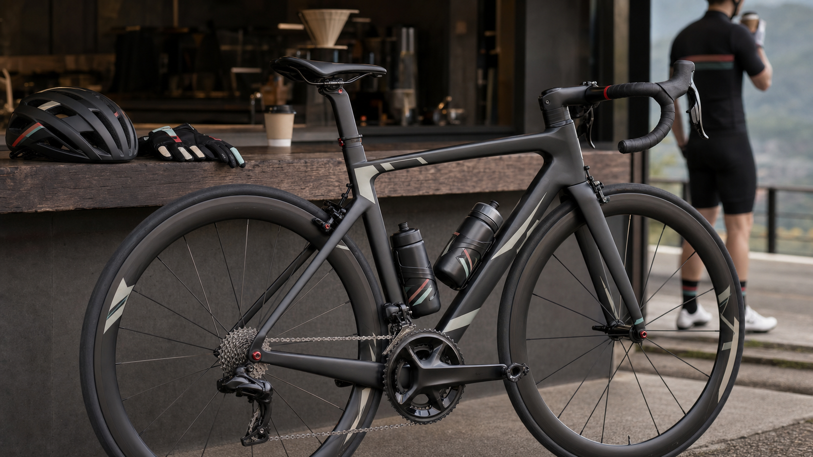
In the cycling world, a bike’s performance is certainly important, but visual aesthetics are equally a significant vehicle for a rider’s identity. When you see a road bike with harmonious colors and meticulous details, even from across a group of riders, you can sense the owner’s attitude toward cycling life.
Taiwan’s road bike aesthetic culture has matured rapidly over the past decade, evolving from the early “use whatever is available” functional-first mindset to today’s deep attention to color systems, brand identity, and personalized details. This article will analyze the core logic of road bike visual aesthetics and how Taiwanese riders establish their own visual style.
Color Systems: The Three-Color Rule
Professional team designers have a fundamental principle: a bike should use at most three main colors. This isn’t a rule, but an aesthetic logic.
| Color Role | Proportion | Description |
|---|---|---|
| Dominant | 60–70% | Main frame color, determines the overall tone |
| Secondary | 20–30% | Complementary colors for forks, wheelsets, or components |
| Accent | 5–10% | Small-area highlight colors such as bar tape, bottle cages, helmet details |
Common Color Mistakes Among Taiwanese Riders
- Too many similar colors: Using different shades of blue across various components ends up looking cluttered
- Accent color area too large: Fluorescent yellow or orange-red accents taking up too much proportion look visually jarring
- Ignoring metal component colors: The metallic colors of components (silver/gold/black) are also part of the color scheme and are often forgotten
Decal Culture: A Personalized Visual Language
Decals are the most flexible means of personalizing a road bike. Here are several main application methods:
Brand Logo Integration
Taiwan’s top bike manufacturers Giant and Merida offer “hidden logo” options on select models, allowing for a cleaner frame appearance. Some riders even use sandblasting to remove factory stickers and replace them with understated custom decals, pursuing a “bare” aesthetic.
Personal Story Type
Ride mileage decals, commemorative stickers for completed races, and place-name decals from rides in various locations—this “travel journal” style of decal culture is common among long-distance cycling communities. Each sticker is a snapshot of a cycling memory.
Team Identity Type
Team or cycling club sticker designs are important tools for building a sense of belonging. Many local cycling communities in Taiwan have their own designed stickers, serving as one of the signals members use to recognize each other.
Aesthetic Choices in Materials and Texture
Visual aesthetics aren’t just about color; material texture matters just as much:
- Matte vs. Glossy: Matte frames have an understated texture, suitable for those pursuing a Japanese minimalist style; glossy frames have strong visual impact, ideal for actively expressing personality
- Carbon Fiber Weave Pattern: Some high-end frames intentionally leave the carbon fiber weave exposed without paint. This “raw carbon” aesthetic has a dedicated following among Taiwan’s high-end riding circles
- All-Black System: Frame, handlebars, wheelset, and components all in black. This “All Black” style has become very popular in the Taiwanese market in recent years, conveying a mature, understated riding attitude
Overall Coordination of Cycling Apparel and the Bike
True visual aesthetics extend to the rider themselves:
- The main color of the jersey should echo the frame color, or use complementary colors to create visual contrast
- The helmet color is the largest visual area, so coordination with the overall look should be considered when choosing
- Shoes and jersey brands don’t need to match, but the color logic should be consistent
Many Taiwanese riders prepare different jersey combinations for different seasons or different events, presenting different visual styles for specific occasions. This awareness of “complete coordination” brings the visual standard of Taiwan’s cycling events in line with the international level.
Practical Advice
Build your own “inspiration file”: Create a collection on Pinterest or Instagram and save screenshots of road bike color schemes you like. After accumulating 50–100 images, you’ll discover your preferred aesthetic direction, which achieves a more coordinated visual result than “random assembly.”
Decide on the frame color first, then choose components: When purchasing a frame, you should simultaneously think about what color wheelsets and components you’ll pair with it in the future. Many people buy the frame first, only to find they can’t find matching colored components.
The philosophy of understated refinement: In Taiwan’s top-tier rider circles, more and more people are turning toward a “quiet luxury” aesthetic—the exterior looks ordinary, but up close every detail is top-spec. This is harder to achieve than “visual bombardment” and also more enduring to look at.
Conclusion
The visual aesthetics of a road bike are a silent language through which riders communicate with the world. The colors you choose, the decals you apply, and the jerseys you wear all convey a certain riding attitude and life philosophy. The maturity of Taiwan’s cycling culture is partly reflected in this earnest pursuit of aesthetic detail—it’s not vanity, but a form of respect for what you love.
Related Reading
- Road Bike Color Aesthetics: Color Selection Guide, Custom Paint, and Decal Modification Visual Design
- Road Bike Maintenance Culture: The Trade-off Between DIY Repairs and Professional Bike Shops
- Road Bike Premium Culture: The World of Premium Bicycles with Top-Tier Carbon Frames and Limited Edition Paint Jobs
- Night Riding Technical Guide: Light Selection, Visual Adaptation, and Safe Cycling on Taiwan’s Roads
公路車 BB培林大升級! / 備戰海鷗繞圈賽 Canyon Aerod & TIME 一起改 / MIT大廠 CEMA對鎖式陶瓷培林BB & 導輪 / 公路車 / CT Yeh
2 年前
「悲情男車友」創作單曲 爆笑MV / 公路車 / CT Yeh / 4K劇情版
7 個月前
碟煞公路車 優缺點?換車一年半實際經驗分享 / 公路車 / CT Yeh
2 年前
一個測試有沒有認真練車的方法😂 #公路車
10 個月前
「敗家車友」創作單曲MV / 公路車 / CT Yeh
7 個月前
#公路車 #Fitting 靠人工智慧APP 幫你調整單車
6 年前
趣味單車配件:多功能智慧尾燈 / 有方向燈 可app編輯圖案!? / GRC x Lumii 聯名款 / 公路車 CT Yeh
9 個月前
碟煞公路車 銑面器 !? 原來銑完差這麼多! 降低蹭碟機率! | TIME 公路車 保養小記錄 | CT Yeh
3 年前